Resources/Spreadsheet dashboards
Step-by-step guideHow to Create a Dashboard from a Spreadsheet
Follow one workflow for XLSX, XLS, or Google Sheets: prepare the spreadsheet, import and transform it, build a verified dashboard, and keep it updated.
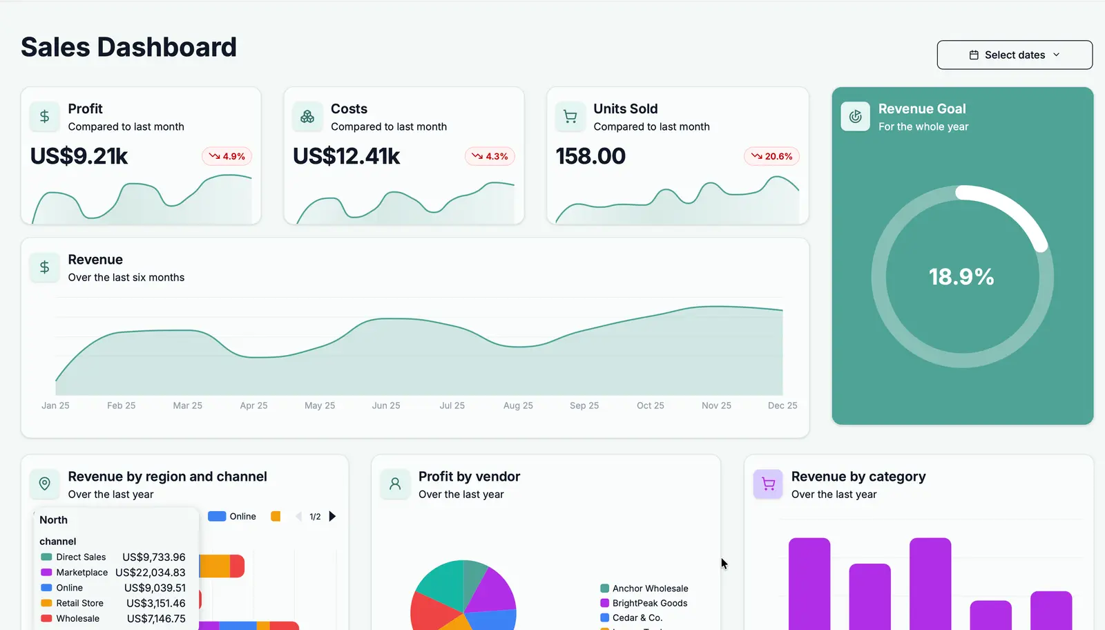
Create a spreadsheet dashboard, step by step
Prepare the spreadsheet
Take a quick look at the data before importing it. If it already matches this format, move on.
Do this
- Start the dataset in cell A1 and put unique column names in row 1.
- Use one row per record and one type of value per column.
- If needed, remove merged cells, titles, notes, subtotals, and blank rows inside the data.
- Keep separate datasets on separate sheets.
- If the sheet has formulas, fix errors and recalculate it. Dashbreeze imports the displayed result—not the formula, pivot table, or macro.
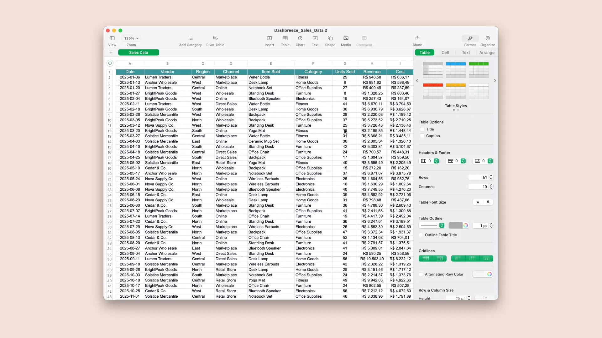
Import Excel or connect Google Sheets
Choose where the spreadsheet lives. Each sheet you select becomes a table you can use in the dashboard.
Do this
- Open Tables and select Create Table.
- For XLSX or XLS: choose Upload File, upload the saved workbook, and select the worksheets you need.
- For Google Sheets: choose Google Sheets, connect your Google account, paste the spreadsheet URL, and select the sheets you need.
- Select Create Table and wait for the import to finish.
Clean and combine the imported data
Only make changes your dashboard needs. These changes do not affect the original spreadsheet.
Do this
- Open the imported table and select a column heading.
- Choose a transformation only when you need it: rename a column, correct its type, format values, filter or sort rows, or move or remove columns.
- Apply shared cleanup here once so every dashboard block uses the same result.
Create a dashboard
Create the dashboard first. Then add the blocks you want to use, one at a time.
Do this
- Select Create Dashboard in the left sidebar.
- Dashbreeze opens the new dashboard in Draft mode.
- You do not need to plan the complete layout yet. In the next step, start with one useful block.
Add the blocks you need
Build one piece at a time. A block can be a chart, number, table, filter, text, or image.
Do this
- Open Blocks in the left sidebar.
- Choose a block type and drag it onto the dashboard.
- Pick a chart for patterns, a KPI for one important number, or a table for individual rows.
- Start with one block. Once it works, add the next one.
Connect data to each block
Now tell the block what to show. Start with the result you want, then choose the matching columns.
Do this
- Select a block on the canvas and open its Data tab.
- Choose the option below that is closest to the result you want.
- Connect the imported table and complete the fields listed for that block type.
- Check the preview while you configure it. You can return and change any field later.
Data setup
What do you want this block to show?
Pick the closest option. You can change the block later.
Show a change or comparison
Choose a Chart
Example: revenue over time or orders by region
- Choose your spreadsheet table.
- For X-Axis or Label, choose a date or category.
- For Values, choose the number to measure.
- Choose a calculation—usually Sum or Count.
Show one important number
Choose a KPI
Example: total revenue, order count, or average price
- Choose the Value setting.
- Select your spreadsheet table and numeric column.
- Choose Sum, Count, or Average.
Show individual spreadsheet rows
Choose a Table
Example: orders with date, customer, and amount
- Choose your spreadsheet table.
- Under Columns, select what readers should see.
- Add a filter only if some rows should be hidden.
Other block types
KPI Trend
Use it when one number also needs a previous-period or previous-year comparison.
Gauge
Use it to compare a current value with a goal.
Dashboard Filter
Add a visible control that lets viewers filter several connected blocks at once.
Dashboard Filter or block filter: which one do I need?
Fixed rule
Filter inside a block
Use this when one chart, KPI, or table should always show a smaller part of the data. You set the rule while editing, and viewers do not change it.
Example: A KPI with Status equals Completed always counts only completed orders. Other blocks stay unchanged.
Viewer control
Dashboard Filter block
Use this when viewers should choose a date, text value, or number and update multiple blocks on the dashboard together.
Example: A Region filter can update the revenue KPI, sales chart, and orders table at the same time.
Set up a Dashboard Filter
- Connect your charts, KPIs, and tables first. Dashbreeze uses those blocks to find the available tables and columns.
- Add a Dashboard Filter block and choose its type: Date, Text, or Numeric.
- For each table, select the matching column the filter should control. For a Region filter, select the Region column in every table that should respond.
- Leave out any block that should not change. A block responds only when its table and matching column are selected.
- Preview the dashboard, choose a filter value, and confirm that every intended block updates.
Customize the dashboard design
Make it feel polished without designing everything from scratch. A theme handles most of the work.
Do this
- Open Theme and apply a theme that fits the dashboard’s audience.
- Select a block and open Block to adjust its colors, chart style, labels, axes, and display options.
- Open Card to adjust the title, background, border, spacing, and typography around that block.
- Keep the theme defaults wherever they already look good.
Arrange the dashboard layout
There is no single correct layout. Put the most useful answer first and keep related blocks together.
Do this
- Drag the main KPIs and charts toward the top of the dashboard.
- Resize blocks so labels and values are readable without wasting space.
- Keep related blocks close together and use text blocks to explain sections when needed.
- Duplicate a block when you need a similar view, then change its data or filter.
- Check the large-screen and small-screen layouts and rearrange either one when necessary.
Finish, publish, and share
Your dashboard is ready to finish once the first block shows the right result.
Do this
- Add the remaining charts, KPIs, tables, filters, or text blocks.
- Place the most important result first and remove anything that does not answer a question.
- Open Publish and select Publish Dashboard.
- Open Share and choose an available public link, protected link, email invitation, or embed code.
Keep the dashboard data up to date
Choose the update path that matches your source. Uploaded files and connected Google Sheets work differently.
Uploaded XLSX or XLS file
- Edit the workbook and save the new version.
- Keep the worksheet names and columns used by the dashboard.
- Open the table in Dashbreeze and select Sync data.
- Upload the new file and wait for the import to finish.
Connected Google Sheets
- Select Sync data when you want the latest changes immediately.
- For scheduled updates, open the table update settings.
- Choose Automatic and select how often Dashbreeze should check the spreadsheet.
- Choose Manual if updates should happen only when you select Sync data.
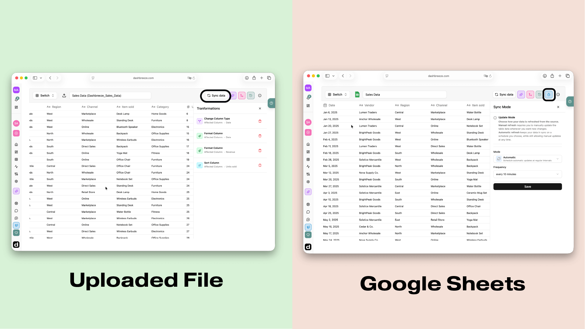
Recap: from spreadsheet to dashboard
You do not need to plan the entire dashboard before you begin. Follow the workflow once, check each result, and improve the dashboard one block at a time.
- 1. Prepare a spreadsheet with column names in the first row and one record per row.
- 2. Upload an XLSX or XLS file, or connect Google Sheets.
- 3. Transform the imported table only when the data needs cleanup.
- 4. Create a dashboard from the left sidebar and add its first block.
- 5. Add blocks, connect their data, and confirm the results against the spreadsheet.
- 6. Apply a theme, arrange the layout, publish, and choose how to share it.
- 7. Upload a new file or sync Google Sheets whenever the source data changes.
Need help with a specific step?
Find detailed product instructions in the Help Center
This tutorial explains the complete spreadsheet workflow. Use these Help Center articles when you need more detail about a particular Dashbreeze screen or setting.
Quick answers
- Does this tutorial work with Excel and Google Sheets?
- Yes. XLSX and XLS files use Upload File. Google Sheets uses a connected Google account and spreadsheet URL. The transformation and dashboard steps are the same.
- Are spreadsheet formulas imported?
- Dashbreeze imports the displayed formula result, not the formula itself. Recalculate and save Excel files before upload. Pivot tables and macros do not become dashboard logic.
- Can I merge two spreadsheet tables?
- Yes, when needed. Open the table that should receive more columns, select Join another table, choose the second table, and match a shared identifier such as Customer ID.
- Will the spreadsheet update automatically?
- Uploaded XLSX/XLS files use Manual mode and require Sync data plus a new upload. Google Sheets can use Manual mode or Automatic mode with a selected update schedule.
- Does Dashbreeze change the source spreadsheet?
- No. Imports and transformations do not edit the Excel file or Google Sheets spreadsheet.
- Which chart should I use?
- Use a line chart for time, a bar chart for category comparisons, a KPI for one number, and a table for individual rows.