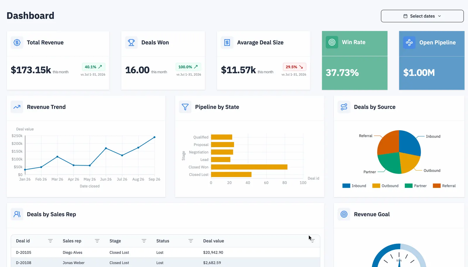
Sales dashboards
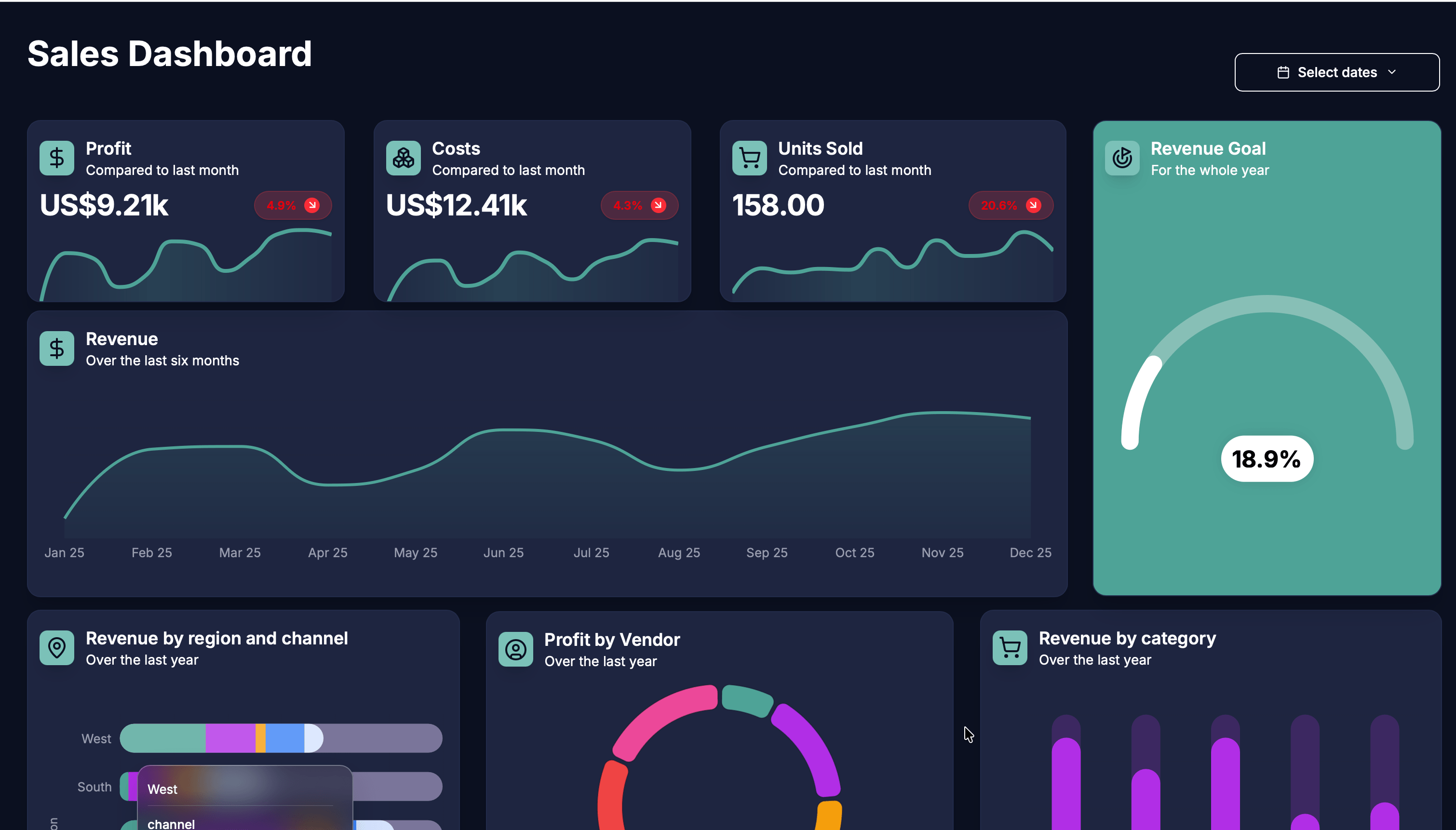
Track revenue, pipeline, average order value, targets, and performance by product, region, or sales representative.
Turn spreadsheets and connected data into interactive dashboards with a drag-and-drop online dashboard builder. Create charts, KPIs, tables, gauges, and filters, then customize, share, or embed your dashboard—no coding required.
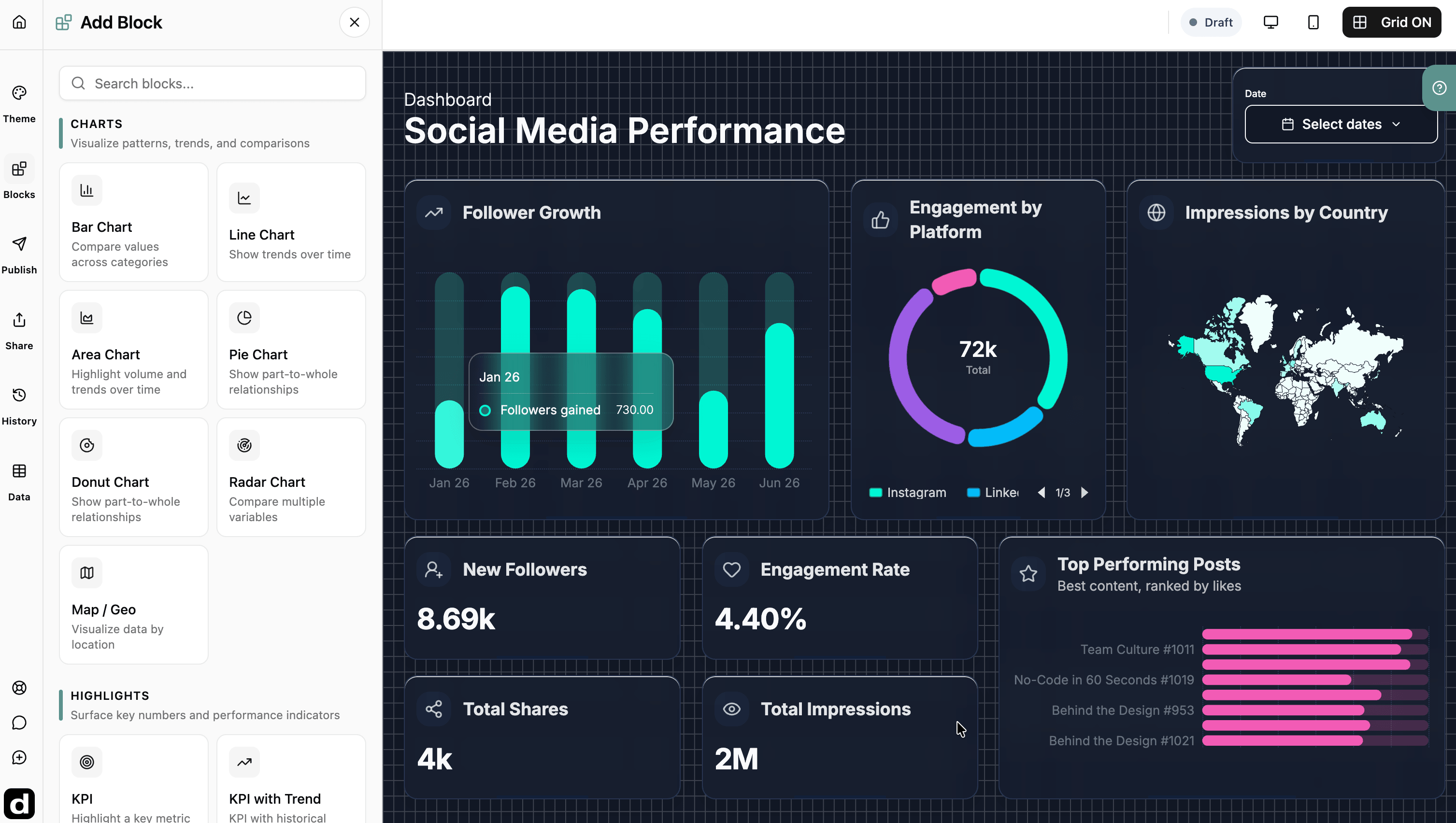
Build one clear view of your data
An online dashboard builder turns raw business data into a visual report that is easier to explore and understand. Instead of manually rebuilding charts in a spreadsheet or presentation, you connect your data once and organize the metrics that matter on a single interactive dashboard.
Dashbreeze gives you a no-code canvas for combining charts, KPIs, tables, gauges, filters, text, images, and embedded content. Use it to monitor performance, explain results, and give teams or clients a current view of the numbers they need.
Dashboard charts and blocks
Create charts, KPIs, tables, gauges, and interactive filters. Compare categories, follow trends over time, show progress toward a target, or let viewers inspect individual records.
Bar chart
Compare values across categories
Dashboard examples and use cases
Give each audience a focused view of its goals, trends, and results while keeping the underlying data in one reporting workflow.
Track revenue, pipeline, average order value, targets, and performance by product, region, or sales representative.
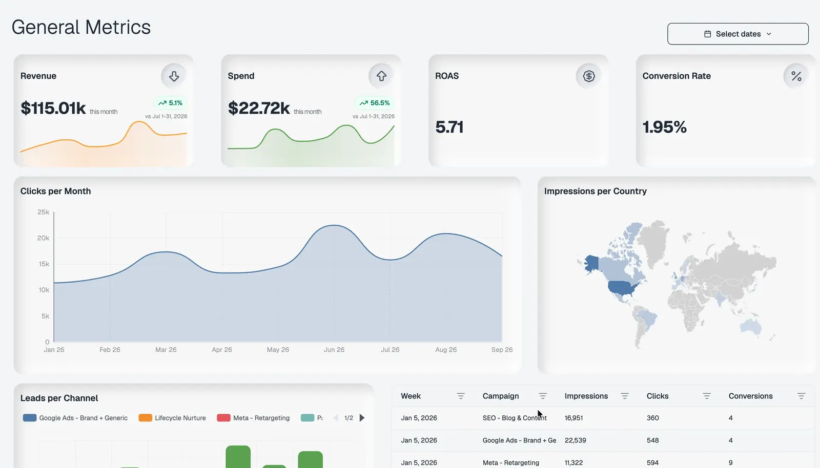
Bring campaign, traffic, conversion, and channel metrics together to see which activities drive results.
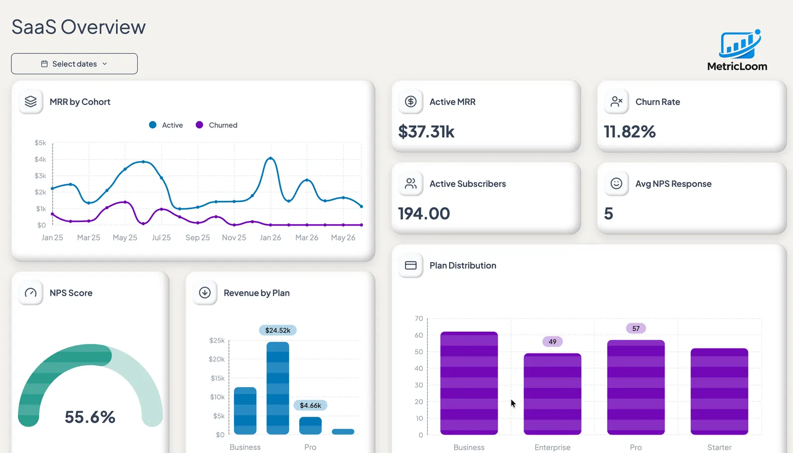
Summarize company KPIs and trends in a concise view that helps leaders spot changes and make decisions.
Share a branded, interactive report through a link or embed it in the portal where your clients already work.
How to create a dashboard
Build a useful dashboard by starting with the questions your audience needs answered, then connect, visualize, refine, and publish.
Import a file or connect a supported source such as Google Sheets, Google Analytics, Notion, or Airtable.
Select the KPIs, dimensions, comparisons, and date ranges that answer the report’s main questions.
Add visual blocks, arrange the grid, apply a theme, and create separate desktop and mobile layouts.
Share a public or protected link, invite specific viewers, or embed the interactive dashboard elsewhere.
No-code chart customization
Adjust the axes, legend, grid lines, colors, typography, labels, and orientation, then choose how the surrounding card should look.
Dashboard design and layout
Build a consistent visual system across the canvas, typography, charts, cards, and icons. Then arrange and resize each block for desktop and mobile layouts.
Choose a theme to update the background, fonts, chart colors, cards, and icons together.
Growth overview
A complete theme, not a color swap
Revenue
$84.2k
Configure separate layouts for desktop and mobile screen sizes.
Move and resize blocks on a flexible grid layout.
Connected dashboard workflow
Bring information in from the tools you use, prepare it for analysis, and keep the finished report synchronized as the source changes.
Import from Google Sheets, Google Analytics, Notion, Airtable, databases, and uploaded files.
Set column types, clean values, transform tables, and join related data before visualizing it.
Refresh supported connections so the latest values flow into existing charts and metrics.
Choose a template for a common reporting use case, then replace its data, blocks, layout, and style.
Frequently asked questions
Answers about creating, customizing, refreshing, publishing, and embedding dashboards with Dashbreeze.
A dashboard builder is a tool for turning data into a visual, interactive report. It lets you connect or upload data, create charts and key performance indicators, arrange them in a layout, and share the finished dashboard with other people.
Connect or upload your data in Dashbreeze, add charts, KPIs, tables, and filters, then arrange the blocks on a drag-and-drop canvas. You can configure and publish the finished dashboard without writing code.
Yes. You can upload an Excel file or connect Google Sheets, then use its rows and columns to create charts, KPIs, tables, gauges, and filters in Dashbreeze.
Yes. Dashbreeze can bring multiple sources into the same workspace, where you can prepare tables, join related data, and use the resulting data across one dashboard.
Use bar charts to compare categories, line or area charts for trends over time, pie or donut charts for part-to-whole relationships, radar charts for multiple variables, and maps for geographic data. KPIs and gauges work well for headline values and targets.
Connect a supported data source and configure its refresh in Dashbreeze. New source values then flow into the existing charts and metrics without rebuilding the dashboard.
Yes. You can change the canvas, fonts, colors, chart styles, cards, icons, titles, descriptions, and layout. A theme can apply matching canvas, typography, chart, and card styles across the complete dashboard.
Publish the dashboard and require a password for anyone using the link, or invite specific viewers directly by email. You can choose the access method that fits the sensitivity of the data.
Publish the dashboard in Dashbreeze and use its embed option to place the interactive view inside a website, client portal, or internal tool.