Resources/Finance dashboards
Google Sheets tutorialHow to Build a Cash Flow Dashboard in Google Sheets
Turn a Google Sheets cash movement log into a dashboard that shows inflows, outflows, net cash movement, trends, and the records behind each number.
What you will learn
This guide shows you how to turn a Google Sheet into a useful cash flow dashboard. You will start with a business question, prepare the data, choose the right measures, and build a view that helps explain what changed.
The goal is not to display every column. It is to show the few numbers that matter, explain what they mean, and trace them back to the original transactions.
Dashboard scenario
Imagine you run a small company and notice that there is less money in the bank this month. Before adding charts, ask: did sales slow down, did a large expense happen, or did money move between your own accounts?
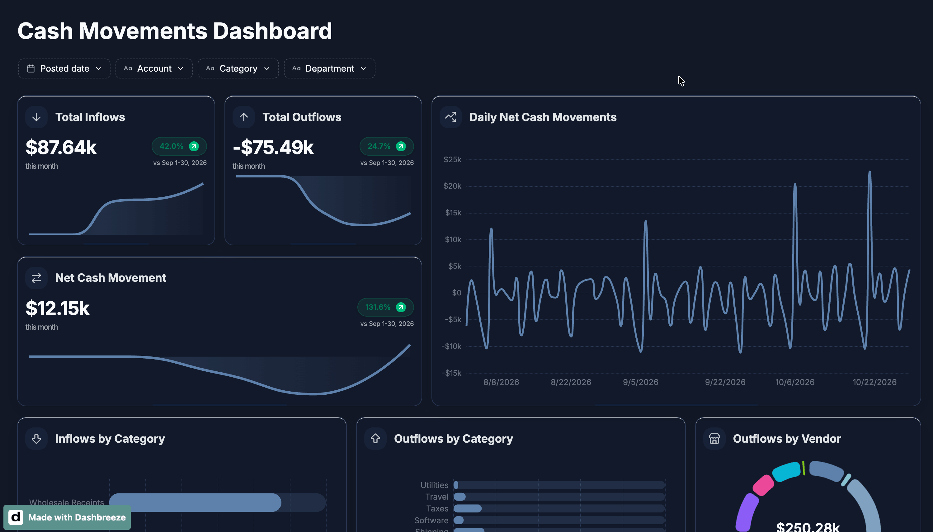
We build the dashboard to answer those questions. KPI blocks show how much came in, how much went out, and the net change. Charts show when the change happened and which categories or vendors caused it. A detail table provides the evidence behind each number.
Cash flow is not profit
Cash flow tells you how money moved through your bank accounts during a period. Profit tells you whether the business earned more than it spent during that period. They are related, but they are not the same: a business can be profitable and still have little cash available. This dashboard is for understanding cash movement, not for replacing a profit-and-loss report.
What the Google Sheet should contain
Start with the `Cash_Transactions` tab. Each row should represent one movement in one bank account. Use `Field_Guide` to understand what each column means before building a chart.
Open the Google Sheets practice workbook →| Column | Purpose |
|---|---|
| Transaction ID | Unique bank movement identifier |
| Posted Date | Date the movement posted to the account |
| Account | The bank account involved |
| Direction | Inflow or Outflow |
| Amount | Positive movement amount in USD |
| Category | Business reason for the movement |
| Vendor or Source | The counterparty |
| Department | Owning team |
| Recurring | Whether the movement is expected to repeat |
| Status | Cleared or Pending |
| Internal Transfer | Whether money moved between company accounts |
| Memo | Short transaction detail |
* During the data-preparation step, you create a calculated Signed Amount column. It keeps inflows positive and outflows negative so the dashboard can calculate net cash movement.
Use the workbook as a guide
Start_Here
What the dashboard should answer and the quality checks to complete first.
Cash_Transactions
Cleared cash movements from two bank accounts.
Field_Guide
Definitions and validation rules for each column.
Dashboard_Map
The blocks, measures, filters, and calculations used in the dashboard.
Main steps covered in the tutorial
Prepare the cash movement sheet
Before building anything, review the source data so you understand what each row represents and which fields can answer the cash questions.
What this step covers
- Use one row per movement, clear headers, consistent dates, and numeric amounts.
- Keep Direction values consistent: Inflow or Outflow.
Connect Google Sheets to Dashbreeze
Next, bring the prepared sheet into Dashbreeze. The imported table becomes the source for every KPI, chart, and detail view in the dashboard.
What this step covers
- Connect Google Sheets and select the worksheet with the cash movements.
- Compare a few rows, dates, categories, and amounts with the original sheet.
Transform and check the data
Before creating the dashboard blocks, make sure the data can be calculated and displayed correctly. Dates must behave like dates, and amounts must behave like numbers.
What this step covers
- Check that date fields are recognized as dates, not text.
- Check that Amount is numeric, then format it as currency.
- Confirm that Direction, Status, and Internal Transfer use consistent values.
Create the Signed Amount column
Amount tells us how much money moved. Direction tells us whether it came in or went out. To calculate the net change, we create a new column that combines both pieces of information: inflows become positive and outflows become negative.
What this step covers
- Use AI to create a calculated column called Signed Amount.
- Keep the original Amount column unchanged.
Set the automatic refresh
Once the data is structured, decide how often the dashboard should check Google Sheets for new or changed movements. This keeps the dashboard useful after it is published.
What this step covers
- Set the refresh schedule to match how often the source sheet changes.
- Keep future rows in the same column structure so each refresh stays consistent.
Create the dashboard
With the data ready, turn the questions from the scenario into dashboard blocks. Use the plan below to choose each block for a reason: summarize the result, explain the change, or show the records behind it.
What this step covers
- Add the three KPIs first, then add the time, category, vendor, and detail views from the plan.
- Keep the same filters across all blocks so every view tells the same story.
| What to track | Why it matters | Element | How it is calculated |
|---|---|---|---|
| Total Inflows | Shows how much cash came in. | KPI with Trend | Sum Signed Amount for incoming rows. Filter: Direction = Inflow, Status = Cleared, and Internal Transfer = No. |
| Total Outflows | Shows how much cash went out. | KPI with Trend | Sum Signed Amount for outgoing rows. Filter: Direction = Outflow, Status = Cleared, and Internal Transfer = No. |
| Net Cash Movement | Shows whether cash increased or decreased. | KPI with Trend | Sum Signed Amount, where inflows are positive and outflows are negative. Filter: Status = Cleared and Internal Transfer = No. |
| Daily Net Cash Movements | Shows when the biggest changes happened. | Line chart | Group Signed Amount by Posted Date. Filter: Status = Cleared and Internal Transfer = No. |
| Inflows by Category | Shows where incoming cash came from. | Bar chart | Group incoming amounts by Category. Filter: Direction = Inflow, Status = Cleared, and Internal Transfer = No. |
| Outflows by Category | Shows what the business spent money on. | Bar chart | Group outgoing amounts by Category. Filter: Direction = Outflow, Status = Cleared, and Internal Transfer = No. |
| Vendors by Outflow | Highlights the vendors driving spending. | Donut chart | Group outgoing amounts by Vendor or Source. Filter: Direction = Outflow, Status = Cleared, and Internal Transfer = No. |
| Outflows Detailed | Lets you check the transactions behind the totals. | Table | Show outgoing transactions for checking totals. Filter: Direction = Outflow, Status = Cleared, and Internal Transfer = No. |
Analyze the results
Once the dashboard is ready, use AI to understand what changed, why it changed, and where to look next.
What this step covers
- Ask what changed in cash movement during the selected period.
- Ask which categories, vendors, or transactions explain the change.
- Use the answer to decide where to look next or what action to take.
Publish and keep it current
Finally, arrange the most important information first and publish the dashboard. The result should help someone understand the cash position without opening the source sheet.
What this step covers
- Put the most important KPIs first, publish the dashboard, and choose how to share it.
Key notes from the tutorial
Here are the main ideas to remember from the tutorial:
- Review the source data before creating the dashboard.
- Make sure dates are dates, amounts are numeric, and currency is formatted correctly.
- Create Signed Amount so inflows are positive and outflows are negative.
- Use Cleared movements and exclude internal transfers in every block.
- Choose each KPI or chart because it answers a specific cash question.
- Use the dashboard to see what changed and AI to explore why.
- Set automatic refresh so the dashboard stays current as the sheet changes.
- Keep the layout simple so the cash story is easy to understand.
Quick answers
- Why should internal transfers be excluded from cash flow totals?
- An internal transfer appears as an outflow in one company account and an inflow in another. Excluding both sides prevents the same cash from being counted twice in operating cash movement.
- What columns should a cash movement spreadsheet include?
- At minimum, use Date, Description, Type, Category, and Amount. Add Account, Payee, or Reference when those fields help explain or reconcile a movement.
- How do I calculate net cash movement?
- Net cash movement is total inflows minus total outflows for the selected period. Keep the direction of each movement consistent so the result can be checked easily.
- Can I use this dashboard for multiple accounts?
- Yes. Add an Account column, keep account names consistent, and use a filter or chart breakdown to compare accounts without mixing their records accidentally.
- How often should the dashboard be updated?
- Use the update frequency that matches the decisions the dashboard supports. Daily or weekly updates are common for operational cash monitoring; always validate the latest sync against the source sheet.