
Typography Blocks
Add titles, subtitles, and text, and turn a text block into a link.


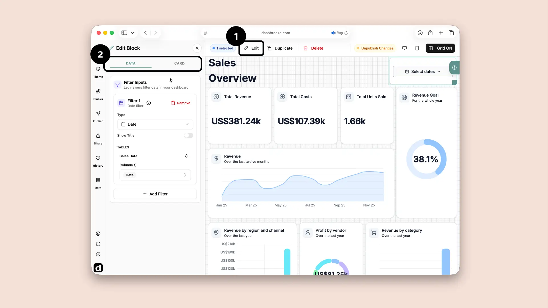
A Filter block is an interactive control for the people who consume the dashboard. The dashboard creator decides what the filter controls. People viewing the dashboard then use it to focus on the information they need. For example, they can choose Brazil in a Country filter and update several charts and tables at the same time. A single Filter block can contain controls for dates, text, and numbers.
Choose what information the block uses.
Style the container around the block.
Start with Data:The block needs information before it can show anything. The Card tab is optional. If you do not customize it, the block and its card follow the dashboard theme. Use this tab only when you want this block to look different from the theme.
Choose the kind of filter and the columns it should control.
Connect tables to blocks first:The Filter block shows the tables connected to other blocks on this dashboard. Choose which columns from those tables the filter should control. If no block is connected to a table, no tables or columns appear here, and the Filter block cannot be configured yet.
1. Type
RequiredChoose the type first:Changing the Type removes any connected columns that no longer match. After changing it, review Tables and Columns again.
2. Show Title
Optional3. Tables and Columns
RequiredThe entire Card tab is optional. If you do not customize it, the card follows the dashboard theme. Use this tab only when you want this card to look different.
Card Style
OptionalChoose the style that fits the dashboard. This changes the card surface, border, corners, and shadow. It does not change the block's data.
Background
OptionalIcon
OptionalTitle
OptionalDescription
OptionalFooter
OptionalTypography is separate:Title, Description, and Footer each have their own color, font, size, and weight. These settings do not change the data inside the block.