Dashbreeze logo

Data Block: Radar Chart

Data Block: Radar Chart - Compare one measure across categories in a radar chart, with optional groups.

Compare one measure across categories in a radar chart, with optional groups.

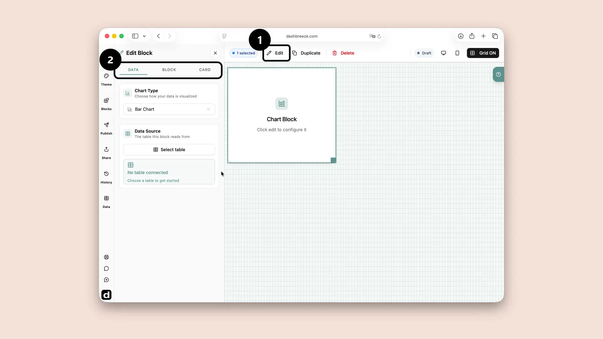
A chart block selected in the dashboard editor, with the Edit button and the Data, Block, Card tabs highlighted
Select the chart block and click Edit (1). Use the Data, Block and Card tabs (2) to configure it.

A radar chart compares several measures at once around a circular grid, such as scores across categories or usage across features. Select a radar chart block, then open Edit Block to connect it to a table and work through the Data, Block, and Card tabs.

Understand the settings tabs

1Data

Choose what information the block uses.

2Block

Change how the information is displayed.

3Card

Style the container around the block.

Start with Data:The block needs information before it can show anything. The Block and Card tabs are optional. If you do not customize them, the block and its card follow the dashboard theme. Use these tabs only when you want this block to look different from the theme.

Configure the Data tab

Choose the table columns that build the chart.

Source table

SkillScore
Design40
Sales70
Support55
The label column creates the categories around the radar. The value controls how far each point is from the center.

1. Data Source

Required
Choose the table that holds the information you want to show. For example, choose an Orders table to build a sales chart.

2. Label

Required
Choose the category placed around the radar, such as Skill, Feature, or Department.

3. Values

Required
Choose the column that contains the number or item you want to measure. Then choose its Calculation Mode.

How Calculation Mode changes the result:The selected mode turns many source values into the number plotted by the block.

Example values:102020
Sum
50
Average
16.7
Minimum
10
Maximum
20
Count
3
Count Distinct
2
Count Distinct returns 2 because the values contain two unique numbers: 10 and 20.

Choose Sum for a total

Use it for values you want to add together, such as total revenue, units sold, or hours worked.

Choose Average for a typical value

Use it for questions such as average order value, average rating, or average response time.

Choose Minimum for the smallest value

Use it to find the lowest price, shortest time, or smallest result.

Choose Maximum for the largest value

Use it to find the highest sale, longest time, or largest result.

Choose Count to count values

Use it to answer questions such as how many orders, customers, or records contain a value in the selected column.

Choose Count Distinct to count unique values

Use it when repeated values should count once, such as the number of different customers, countries, or products.

The available modes depend on the column type. Number columns support every mode. Text and date columns support Count and Count Distinct.

Group Values

Optional
Use this to compare the same radar categories for different groups. For example, the radar categories can be Skills and the groups can be Departments. The chart draws one colored shape for Sales and another for Support. Leave Group Values off when you only need one shape with the overall scores.

Scores grouped by department

SalesSupport
Each department gets its own color and radar shape. The shapes use the same category axes, so they can be compared directly.

Filter

Optional
Filter the chart by another condition from the table selected in Data Source. Choose a column, choose the condition, and enter the value to match. Leave this empty to use every row.

Example: filter the selected table:If the chart uses the Orders table, you can choose its Region column and set the condition to equals Europe. The chart then calculates its result using only European orders. This filter belongs to this block, and it does not edit the Orders table. To let viewers choose the condition themselves, add a Filter block to the dashboard.

Configure the Block tab

The Block tab controls how the radar chart looks:

  • Data Colors

    Optional
    Apply a color palette to the whole chart. Use Customize individual colors when one category or series needs a different color. If you do not customize the colors, they follow the dashboard theme.
  • Font

    Optional
    Change the typeface used by chart labels and the legend. If you do not choose one here, the chart follows the dashboard theme's font.
  • Chart Style

    Optional

    Choose the visual style used to draw the chart. This changes its appearance. It does not change the chart type, values, or calculations. If you do not choose a different style, the chart follows the dashboard theme.

    Default:
    A simple chart with the standard appearance
    Classic:
    A traditional chart with clear, familiar shapes
    Glow:
    Bright colors with a glowing effect
    Modern:
    A softer, contemporary appearance
    Pattern:
    Patterns added to the chart colors
  • Legend

    Optional
    Show which color belongs to each category, group, or value. Hide it when the meaning is already clear.
    Revenue Target
    The legend connects each color to its meaning.
  • Radar Lines: show or hide the rings and radial lines, and set their color.
    Radar Lines are the rings and lines behind the colored data shape.

Configure the Card tab

The entire Card tab is optional. If you do not customize it, the card follows the dashboard theme. Use this tab only when you want this card to look different.

Card Style

Optional

Choose the style that fits the dashboard. This changes the card surface, border, corners, and shadow. It does not change the block's data.

Default:
Standard card
Elevated:
Rounded with a stronger shadow
Cyber:
Glowing colored edges
Claymorphic:
Soft three-dimensional shading
Flat Panel:
Square surface without a shadow
Glass:
Transparent, blurred surface
Neobrutalist:
Thick border and high contrast
Neuromorphic:
Soft surface blended into the background
Gradient:
Background that blends colors

Background

Optional
Show or hide the card surface. Available colors follow the selected style.

Icon

Optional
Add a symbol to the header. Choose its icon and background colors.

Title

Optional
Name the block. Keep it short and clear.

Description

Optional
Add context such as the unit or date range.

Footer

Optional
Add a source, update time, or short note at the bottom.

Typography is separate:Title, Description, and Footer each have their own color, font, size, and weight. These settings do not change the data inside the block.

Up Next