
Dashbreeze logo

Data Block: Table

Data Block: Table - Show rows and columns, choose visible columns, and style headers, rows, and borders.

Show rows and columns, choose visible columns, and style headers, rows, and borders.

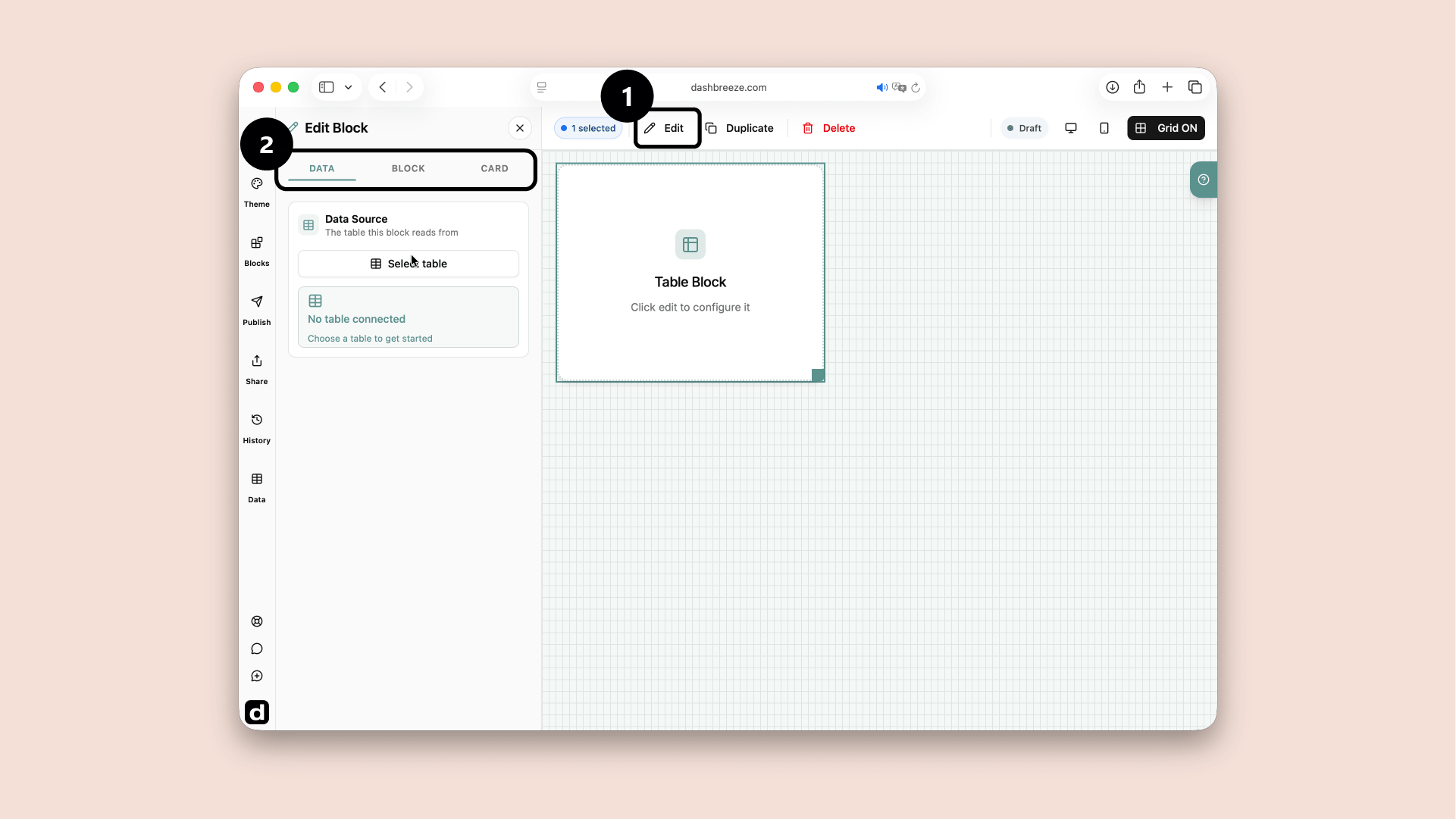
A Table block selected in the dashboard editor, with the Edit button and the Data, Block, Card tabs highlighted
Select the Table block and click Edit (1). Use the Data, Block and Card tabs (2) to configure it.

A Table block shows detailed information in rows and columns. For example, it can show a list of orders with the date, customer, status, and amount. Use it when viewers need to read individual records instead of only seeing a total or chart.

Understand the settings tabs

1Data

Choose what information the block uses.

2Block

Change how the information is displayed.

3Card

Style the container around the block.

Start with Data:The block needs information before it can show anything. The Block and Card tabs are optional. If you do not customize them, the block and its card follow the dashboard theme. Use these tabs only when you want this block to look different from the theme.

Configure the Data tab

Choose which records and columns the block displays.

1. Data Source

Required
Choose the table whose records you want to show. Each source row can become one row in the block.

2. Columns

Required
Choose which columns viewers can see in this block. For example, show Customer, Status, and Amount, but hide an internal ID.

Filter

Optional
Show only records that match another condition from the selected Data Source. For example, show only orders whose Status equals Paid. Leave this empty to show every record.

Example: filter the selected table:If the Table block uses the Orders table, you can choose its Region column and set the condition to equals Europe. The Table block then calculates its result using only European orders. This filter belongs to this block, and it does not edit the Orders table. To let viewers choose the condition themselves, add a Filter block to the dashboard.

Configure the Block tab

The Block tab controls the table's appearance and how viewers can interact with it. These settings are optional. If you do not customize them, the table follows the dashboard theme.

Font

Optional
Choose the typeface used by the column headers and table rows.

Header

Optional
Customize the row that contains the column names.
Background
Choose the color behind the column names.
Text
Choose the color of the column names.
Keep headers visible
Keep the column names at the top while viewers scroll through a long table.
Allow sorting
Let viewers click a column header to order its values from low to high, high to low, or alphabetically.
Allow filtering
Let viewers narrow the visible records using a column header.

Sorting is for viewers:Allow sorting lets a viewer click a header to sort that column. It does not save a permanent order for the block.

Row Styling

Optional
Customize the rows that contain the table records.
Background
Choose the main color behind every row.
Text
Choose the color of the values in each row.
Show alternating row colors
Give every second row a different color. This makes neighboring records easier to follow.
Alternate Row Color
This appears after alternating rows are turned on. Choose the second row color.
Highlight rows on mouse over
Change the color of the row under the viewer’s pointer.
Highlight Color
This appears after mouse-over highlighting is turned on. Choose the temporary color shown under the pointer.

Grid Lines

Optional
Add lines between the cells so rows and columns are easier to separate.
Grid Display
Choose both lines, horizontal lines only, or vertical lines only.
Line Color
This appears when grid lines are on. Choose the color used by those lines.

Borders

Optional
Customize the line around the outside of the table.
Border Color
Choose the outside border color. This does not change the grid lines between cells.

Configure the Card tab

The entire Card tab is optional. If you do not customize it, the card follows the dashboard theme. Use this tab only when you want this card to look different.

Card Style

Optional

Choose the style that fits the dashboard. This changes the card surface, border, corners, and shadow. It does not change the block's data.

Default:
Standard card
Elevated:
Rounded with a stronger shadow
Cyber:
Glowing colored edges
Claymorphic:
Soft three-dimensional shading
Flat Panel:
Square surface without a shadow
Glass:
Transparent, blurred surface
Neobrutalist:
Thick border and high contrast
Neuromorphic:
Soft surface blended into the background
Gradient:
Background that blends colors

Background

Optional
Show or hide the card surface. Available colors follow the selected style.

Icon

Optional
Add a symbol to the header. Choose its icon and background colors.

Title

Optional
Name the block. Keep it short and clear.

Description

Optional
Add context such as the unit or date range.

Footer

Optional
Add a source, update time, or short note at the bottom.

Typography is separate:Title, Description, and Footer each have their own color, font, size, and weight. These settings do not change the data inside the block.

Up Next