

Data Block: Gauge
Show progress toward a goal as a radial gauge.


A KPI with Trend shows three things: an important number, a small line showing that number across five comparable periods, and an optional percentage showing whether it increased or decreased.
For example, the block can show $12,000 in revenue for this month. The line shows the latest five monthly totals, and the comparison can show that revenue is 20% higher than last month.
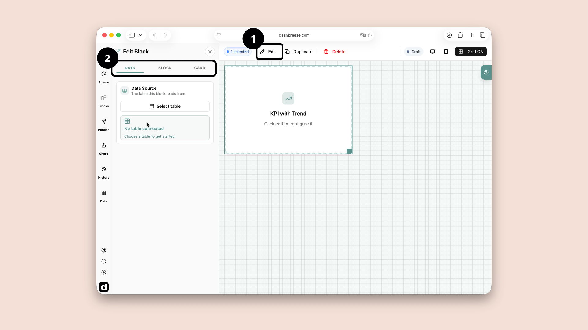
Select the block and click Edit to configure its Data, Block, and Card tabs.
Choose what information the block uses.
Change how the information is displayed.
Style the container around the block.
Start with Data:The block needs information before it can show anything. The Block and Card tabs are optional. If you do not customize them, the block and its card follow the dashboard theme. Use these tabs only when you want this block to look different from the theme.
Choose the date and value used to build the KPI and its trend.
1. Data Source
Required2. Trend Label
Required3. KPI Value
RequiredHow Calculation Mode changes the result:The selected mode turns many source values into the number plotted by the block.
Choose Sum for a total
Use it for values you want to add together, such as total revenue, units sold, or hours worked.
Choose Average for a typical value
Use it for questions such as average order value, average rating, or average response time.
Choose Minimum for the smallest value
Use it to find the lowest price, shortest time, or smallest result.
Choose Maximum for the largest value
Use it to find the highest sale, longest time, or largest result.
Choose Count to count values
Use it to answer questions such as how many orders, customers, or records contain a value in the selected column.
Choose Count Distinct to count unique values
Use it when repeated values should count once, such as the number of different customers, countries, or products.
The available modes depend on the column type. Number columns support every mode. Text and date columns support Count and Count Distinct.
Compare against
OptionalPrevious period: compare with the period directly before the current one. If the current period is April, the comparison is March.
Same period last year: compare with the same dates one year earlier. April 2026 is compared with April 2025.
No comparison: show the current value and trend without a comparison badge.
The default is Previous period. You do not need to select it manually unless you want a different option.
Current period
April 2026 · $12,000
Previous period
March 2026 · $10,000 → change: +20%
Same period last year
April 2025 · $8,000 → change: +50%
No comparison
Show $12,000 without a comparison badge.
Default period
OptionalDefault example:Imagine it is April. The block shows April's value and trend. Because Compare against defaults to Previous period, it compares April with March.
Filter
OptionalExample: filter the selected table:If the KPI with Trend block uses the Orders table, you can choose its Region column and set the condition to equals Europe. The KPI with Trend block then calculates its result using only European orders. This filter belongs to this block, and it does not edit the Orders table. To let viewers choose the condition themselves, add a Filter block to the dashboard.
The Block tab controls the value, comparison indicator, and trend chart. Everything here is optional:
Style
OptionalChoose how the value, comparison badge, and trend line is drawn. This changes its appearance, not its data or calculation.
Value Typography
OptionalChange Indicator
OptionalTrend Chart
OptionalThe entire Card tab is optional. If you do not customize it, the card follows the dashboard theme. Use this tab only when you want this card to look different.
Card Style
OptionalChoose the style that fits the dashboard. This changes the card surface, border, corners, and shadow. It does not change the block's data.
Background
OptionalIcon
OptionalTitle
OptionalDescription
OptionalFooter
OptionalTypography is separate:Title, Description, and Footer each have their own color, font, size, and weight. These settings do not change the data inside the block.