
Data Block: Radar Chart
Compare one measure across categories in a radar chart, with optional groups.

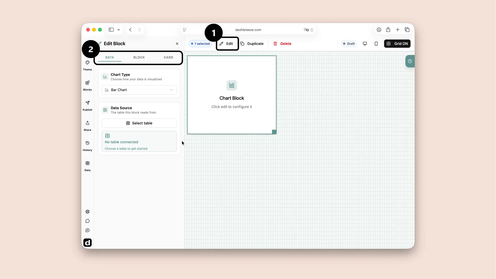
A pie chart shows how a total splits into parts, drawn as a full circle rather than a donut's ring. Select a pie chart block, then open Edit Block to connect it to a table and work through the Data, Block, and Card tabs.
Choose what information the block uses.
Change how the information is displayed.
Style the container around the block.
Start with Data:The block needs information before it can show anything. The Block and Card tabs are optional. If you do not customize them, the block and its card follow the dashboard theme. Use these tabs only when you want this block to look different from the theme.
Choose the table columns that build the chart.
Source table
1. Data Source
Required2. Label
Required3. Values
RequiredHow Calculation Mode changes the result:The selected mode turns many source values into the number plotted by the block.
Choose Sum for a total
Use it for values you want to add together, such as total revenue, units sold, or hours worked.
Choose Average for a typical value
Use it for questions such as average order value, average rating, or average response time.
Choose Minimum for the smallest value
Use it to find the lowest price, shortest time, or smallest result.
Choose Maximum for the largest value
Use it to find the highest sale, longest time, or largest result.
Choose Count to count values
Use it to answer questions such as how many orders, customers, or records contain a value in the selected column.
Choose Count Distinct to count unique values
Use it when repeated values should count once, such as the number of different customers, countries, or products.
The available modes depend on the column type. Number columns support every mode. Text and date columns support Count and Count Distinct.
Filter
OptionalExample: filter the selected table:If the chart uses the Orders table, you can choose its Region column and set the condition to equals Europe. The chart then calculates its result using only European orders. This filter belongs to this block, and it does not edit the Orders table. To let viewers choose the condition themselves, add a Filter block to the dashboard.
The Block tab controls how the pie chart looks:
Data Colors
OptionalFont
OptionalChart Style
OptionalChoose the visual style used to draw the chart. This changes its appearance. It does not change the chart type, values, or calculations. If you do not choose a different style, the chart follows the dashboard theme.
Legend
OptionalNo axis or grid options:Pie charts have no X or Y axis, so Grid Lines, Axis Lines, and Orientation don't apply here.
Donut and pie charts read data the same way and offer the same Block settings. Pick whichever shape fits your dashboard's style — a donut leaves room for a label or number in the center, while a pie fills the full circle.
The entire Card tab is optional. If you do not customize it, the card follows the dashboard theme. Use this tab only when you want this card to look different.
Card Style
OptionalChoose the style that fits the dashboard. This changes the card surface, border, corners, and shadow. It does not change the block's data.
Background
OptionalIcon
OptionalTitle
OptionalDescription
OptionalFooter
OptionalTypography is separate:Title, Description, and Footer each have their own color, font, size, and weight. These settings do not change the data inside the block.